Fluid typography with CSS clamp()
Table of contents
Building a dynamic, animated, responsive interface from a Figma file is like bringing Frankenstein’s monster to life — it’s easy to end up with something uncontrolled and inconsistent, caused by elements that don’t quite fit together, and part of it is due to having to interpret the design.
The workflow
We’re used to receiving a Figma file with interface “snapshots”, and although we get a lot of information about the elements that compose it — and there may even be prototypes that illustrate the animation style — what about the in-between resolutions?
It’s not viable to adapt a design to many or all different device sizes, so we’re forced to interpret what happens in the grey zones.
1440px is almost double 768px, and it makes sense for an h1 to grow from 30px to 80px, for example — but what happens at 1024px? And at 1200px? At 1339px, is it still 30px?
Using multiple breakpoints is repetitive and verbose, so ideally, sizing should adapt to the device width without having to reset values every time a new breakpoint is reached.
Clamp()
It takes 3 parameters: a minimum value, an ideal value, and a maximum value, and the function applies the ideal value as long as it stays within its limits.
📚 If you need a refresher on how clamp() works, we wrote an article about it
Fluid typography
To make it fluid, we need to use relative units, and since we want it to respond to the viewport, we’ll use vw.
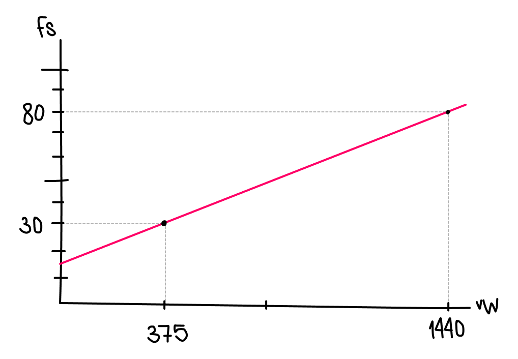
For a heading that is 30px at 375px and 80px at 1440px, we already have the min and max values, and the ideal value could be 7vw, for example, because visually it seems to fit → clamp(30px, 7vw, 80px).
However, 7vw is arbitrary and can produce unexpected results, so to fine-tune it we can calculate the ratio at a specific point — for example at 1440px → 80 / 1440 * 100 = 5.5 → convert it to CSS → 5.5vw and apply it → clamp(30px, 5.5vw, 80px).
Although this is better, it still won’t fit correctly because the relationship at the other end is different → 32 / 375 * 100 = 8.53.
So with a 5.5vw value, the heading will reach 30px below 375px, whereas if we use the minimum ratio → clamp(30px, 8.53vw, 80px) we’ll reach 80px before 1440px.
Linear progression
The problem is that we’re looking for linear growth across a given range, but the font-size / width ratio between known points isn’t the same:
80 / 1440 * 100 = 5.5 and 32 / 375 * 100 = 8.53. The approximated value clearly doesn’t work — but if we know two points, we can draw a straight line between them.
📚 There are online calculators, but learning how to calculate it yourself is more nourishing — it integrates better, removes the magic, and opens the door to other ideas worth exploring
The general formula for a line equation is D = aT + b where a is the slope (rate of change) and b is the intercept (value when T is 0).
The slope is calculated as → a = (D2 - D1) / (T2 - T1) and the intercept is → b = D1 - aT1. T is the viewport width in real pixels, but we must convert it to vw because that’s the unit CSS understands → 1vw = 100T ⇒ T = 100vw.
# (375, 30), (1440, 80)

a = (80 - 30) / (1440 - 375)
a = 50 / 1065
a ≈ 0.046948

b = 30 - a * 375
b = 30 - (0.046948 * 375)
b = 30 - 17.6055
b ≈ 12.3945

D(w) = 0.046948w + 12.3945

w = 100vw

D = 0.046948(100vw) + 12.3945
D = 4.6948vw + 12.3945px

# CSS:
calc(4.695vw + 12.39px)

# Clamp:
# calc() function can be deleted inside clamp()
clamp(30px, (12.39px + 4.695vw), 80px)
So 12.39px + 4.695vw is the exact value we were looking for — no approximations 🔥 This guarantees that the minimum size is applied at the smallest resolution, and that it grows progressively until it reaches the defined breakpoint, where it will reach its maximum size.
Other applications
We can use this for any CSS property that accepts a <length> value, for example padding, if we want the inner spacing of a container to grow as the viewport width grows.
BONUS — @function
Doing these calculations manually can be repetitive, and although it’s not fully supported, we could take advantage of @function to create a function that calculates the scale automatically.
@function --a(--D1, --D2, --T1, --T2) {
  result: calc((var(--D2) - var(--D1)) / (var(--T2) - var(--T1)));
}

@function --b(--D1, --D2, --T1, --T2) {
  result: calc(var(--D1) - (var(--D2) - var(--D1)) / (var(--T2) - var(--T1)) * var(--T1));
}


h1 {
  /* D = ((D2 - D1) / (T2 - T1)) * T + (D1 - ((D2 - D1) / (T2 - T1)) * T1) */
  --D1: 30px;
  --D2: 120px;
  --T1: 600px;
  --T2: 1440px;

  --a: --a(var(--D1), var(--D2), var(--T1), var(--T2));
  --b: --b(var(--D1), var(--D2), var(--T1), var(--T2));
  --fx: var(--a) * 100vw + var(--b);

  font-size: clamp(var(--D1), var(--fx), var(--D2));
}
Check-out the full demo:
Conclusion
There will always be blind spots, grey areas, non-explicit intentions — and therefore invisible ones — in the materials we work with. But with this technique, we can help our monster look more organic and more natural. More alive.
Resources
comments powered by DisqusIf you find it interesting
If you have any doubt or you want to chat about this topic, as if you find interesting the content or our profiles and you think we could build something together, do not hesitate to contact us trough the email address hola@mamutlove.com